Talk figures are different from paper figures
As an academic, I see a lot of talks. In general, good presentations tend to be based on a good slide deck; even very capable speakers have a tough time reaching their audience when their slides are a mess. One common pitfall I often see is that many researchers will take figures or diagrams directly from their papers, upon which the talk is usually based, and paste them into their slides. It’s often clear to the audience when this happens, since figures in papers tend to be rich with information that can be distracting in a talk. My advice:
Avoid using unedited paper figures in talks.
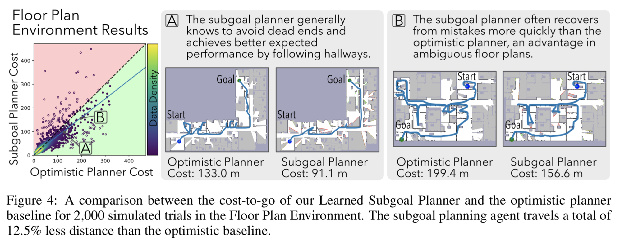
For an example of what you might do when moving a figure from a paper to a talk, let’s take a look at an example from my own work. First, here’s a figure from my paper:

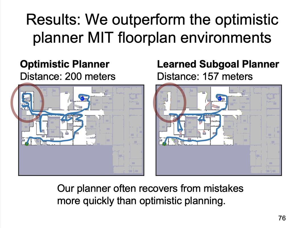
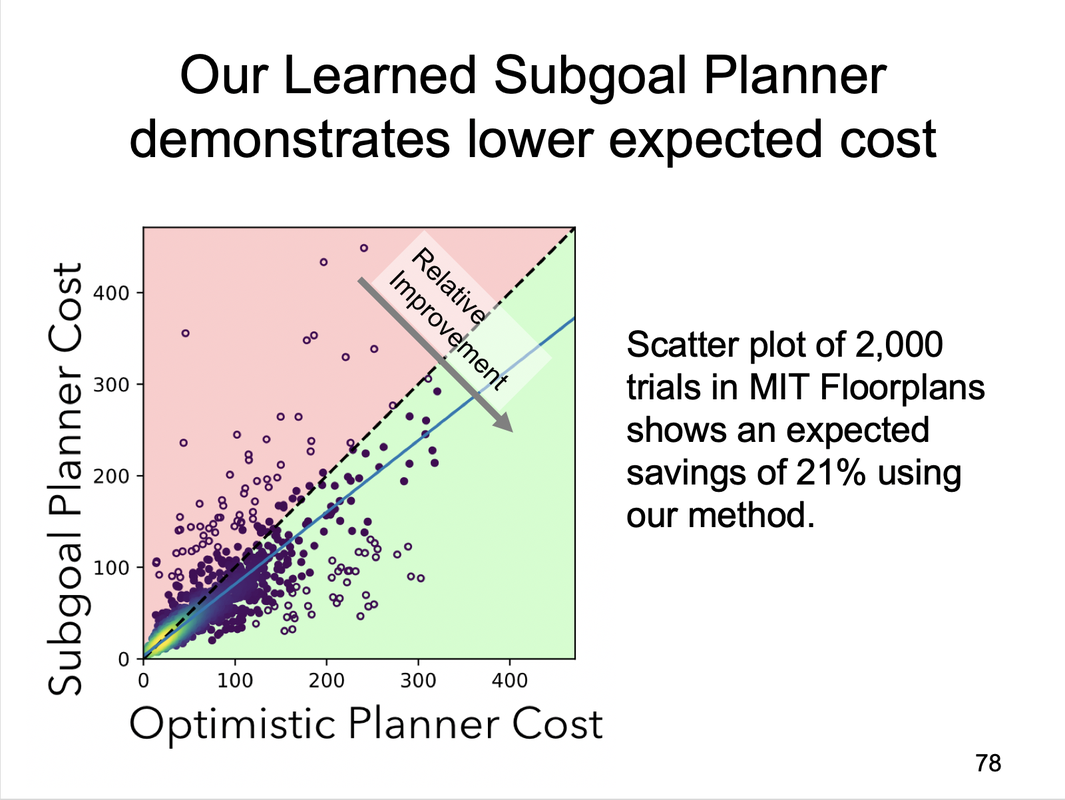
It’s a pretty clean figure (and one I’m pretty happy with), but there’s simply too much information being shown all at once here. In my talk, I split the figure into two slides:


Notice that in both of the slide figures, a few annotations have been added to guide the eye towards what I want the audience to see and a couple other annotations have been removed so as to reduce visual noise. It’s a relatively simple change, but one that makes a ton of difference when compounded across a lengthy technical talk.
Notice also that the slide titles are declarative statements rather than the generic and uninformative title Results; this is something else that tends to make for more effective presentations.
Notice also that the slide titles are declarative statements rather than the generic and uninformative title Results; this is something else that tends to make for more effective presentations.
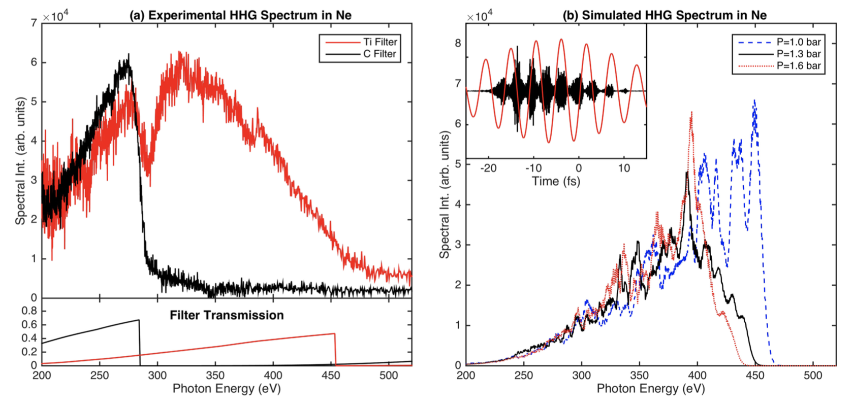
Depending on the paper and subject material, the differences between the talk figure and paper figure can be significant. One community in which I see this a lot is the physics community, when individual plots can represent months of data collection and processing, and so can be incredibly rich with information. Here’s a figure from an old physics paper of mine that is not at all well-suited to appear in a talk:

Why should the figures be different?
In general, the goals of a figure that appear in a paper are different from those that appear in a talk.
- Figures that exist in a paper are often optimized for space. It’s simply a reality of most research these days that the combination of space constraints for publication and ever-higher expectations for acceptance mean that one needs to put a relatively high-density of information in each figure, since a figure needs to be at least as valuable as the text it replaces. Figures should still be as clear as possible, but the amount of stuff one can include for a paper figure is typically relatively high: the reader can spend some time looking over the figure and understanding what it says.
- Talk slides should be optimized so that they communicate only one thing. This is something I often tell clients or students of mine when they show me a presentation draft. If there are too many things to look at . Either the figure needs to be trimmed-down or additional annotations need to be added. Including a full figure caption is a serious communication faux pas, so small (short) text bubbles on top of the figure to describe key features can go a long way to improving clarity.
How should I modify my figures for talks?
One of my top suggestions when making slides is to ask yourself “What is the point of adding this slide?” If your answer to that question is more than one sentence, you’re probably trying to communicate too much all at once. The same is true for figures: communicate only one thing at a time. Sometimes achieving this goal is a matter of splitting the figure into multiple parts. Other times, splitting the figure may be impossible, but simple annotations—e.g., a circle or arrow indicating the important part of the figure or a text bubble giving important context. Don’t be afraid to mark up your figures for a talk! The audience will thank you for the improved clarity, and those listeners who are sufficiently interested will come find you afterwards or look up your paper.
Also helpful is automating your figure-generation process. If you can remake your figure with minor changes at the push of a button, modifying them will be easy.
Also helpful is automating your figure-generation process. If you can remake your figure with minor changes at the push of a button, modifying them will be easy.
As always, I welcome your thoughts (and personal anecdotes) in the comments below or on Hacker News.
